Brand Identity + UX/UI design

Online accounting with Swiss reliability, in a paperless environment.

Play Video
SERVICES RENDERED

Brand identity

UX / UI design

efid offers fiduciary services in digital format, as well as professional and personalized support focused on the permanent search for effective solutions for entrepreneurs, in order to facilitate their management and decision-making.

Diseño de logotipo mallorca
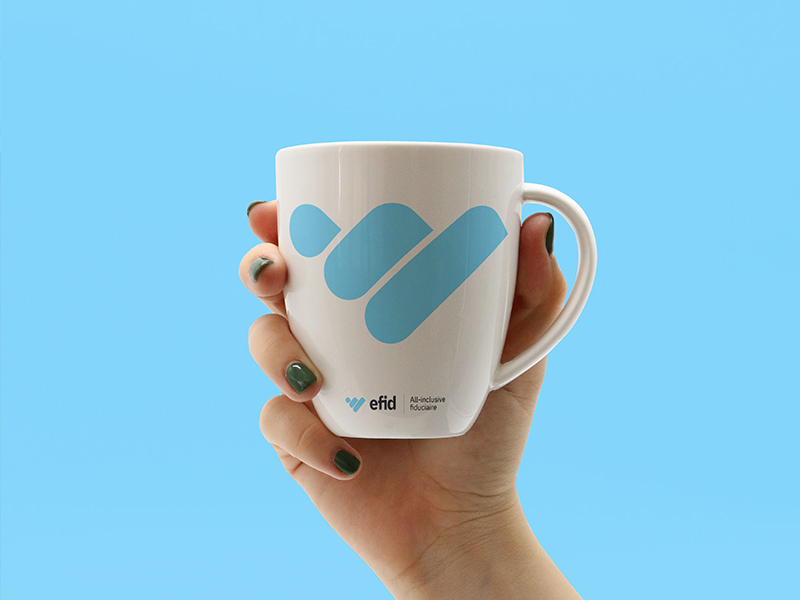
diseño de tazas mallorca
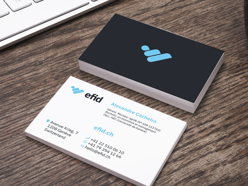
Diseño de tarjetas de visita mallorca
Diseño de logotipo mallorca
Botella de aluminio sostenible
Diseño de experiencia de usuario mallorca
diseño responsive mallorca
DISCOVERY

efid is a 100% digital trust company founded in 2018 based in Geneva, Switzerland. This young and dynamic company offers a new business model based on computer development and digital data processing. The level of the clientele covered and the prospects for development require a redesign of the brand image. The company must redraw its identity according to its current values. This will allow you to increase your visibility, credibility and your level of service for a focused response, corresponding to the capture of the market niche.
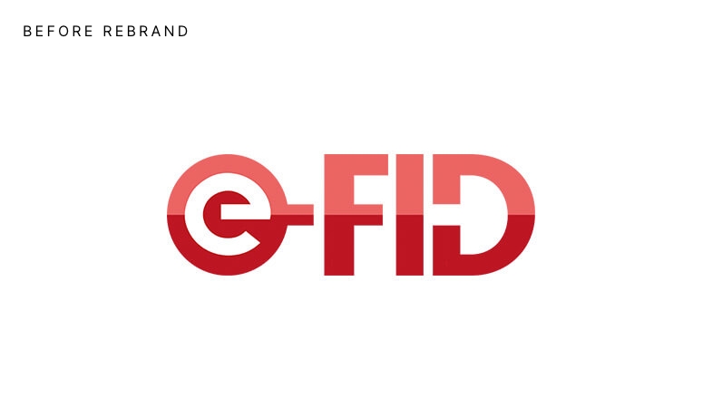
BEFORE
rediseño de logotipo en mallorca
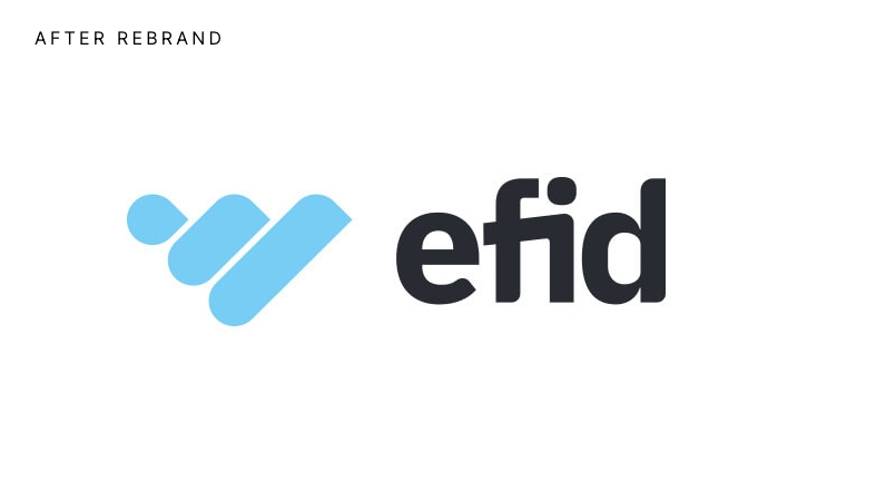
AFTER
rediseño de logotipo en mallorca
STRATEGY

Trust is our main pillar.

efid offers quality services and personalized advice focused on the specific needs of each client, and we set up a clear support process with no surprises.

In addition, efid offers the guarantee of a management under Swiss law and rigor. Having developed their own technology gives them optimal control over the processing of the data, which is stored in Switzerland.

efid is a company with a human character backed by technology that brings them closer to their customers. We seek to develop a close relationship with your clients, and a structure that allows them to be in communication and in permanent connection with their needs.

They are a paperless company focused on the sustainable economy. The efid technology allows you to be connected to your clients’ banking platform to offer them an updated account situation with a bank balance that corresponds to the accounting balance. The data processing is encrypted in real time, which helps to improve financial and tax planning to optimize the situation of each entrepreneur. efid works tirelessly on operational performance, as well as regularity of execution and data analysis.

BUILDING

The visual identity of efid is the result of analyzing the values ​​and mission of the company, translated into a visual concept.

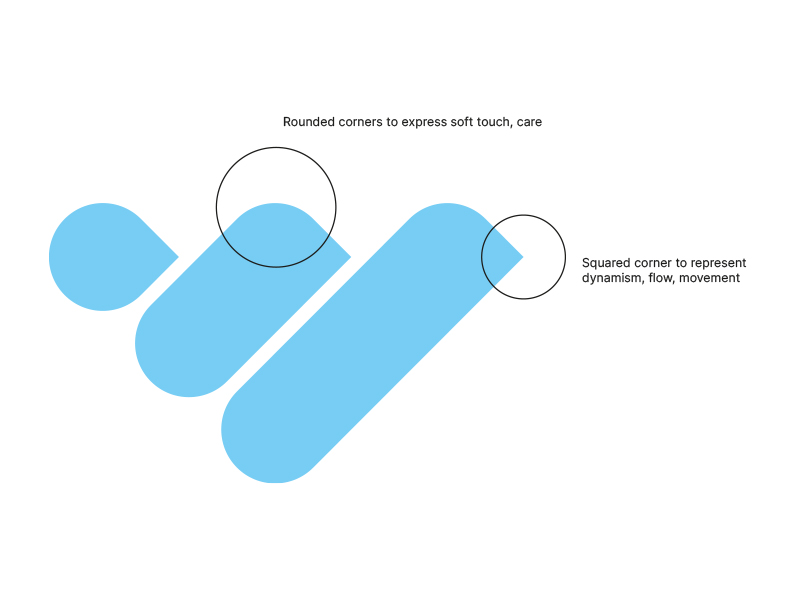
The main element of the brand logo is three diagonal lines that form a bar graph. This symbol is based on the idea of ​​growth. It also evokes the stylized shape of the heart, reminding us that efid cares about its customers but also about the planet, because it is a “paperless” company.

The logo is associated with an open source linear sans-serif font. A fluid design with rounded contours, which ensures better readability on all media and gives a cleaner and more modern look. Represents experience and confidence. These attributes are reinforced by the use of a blue color that represents these same values ​​in color psychology. Blue is generally associated with knowledge, loyalty, and is consistently associated with peace and quiet. Blue is also associated with depth, experience, and stability. It is a color especially suitable for a male audience. The vibrant shade of blue was chosen to represent the digital world and technology in accordance with the brand image.

The name E-Fid has also been modified to give it a new meaning.

The hyphen has been removed to create a more compact and symmetrical four-letter word. But also easy to pronounce and memorize. All letters are now written in lowercase to express a friendlier and more human feeling.

This set of elements is found in a coded and coherent universe based on strong values ​​and an emotional response linked to visual symbols.
ajuste tipografico mallorca

The main element of the brand logo is three diagonal lines that form a bar graph. This symbol is based on the idea of ​​growth. It also evokes the stylized shape of the heart, which reminds us that efid cares about its customers but also about the planet, because it is a “paperless” company.

ajuste tipografico mallorca

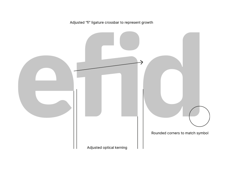
The link between f + i with an ascending until represents the constructive connection between people, as well as the personalized support of efid with its clients. The letter spacing has been visually adjusted and finishers retouched to be consistent with the symbol.

CREDITS

TD Hoteliers – Strategy & Project Management

Do you need help with your project?

No matter what your business is, together we can make it grow and achieve the objectives set.